
Work
Three Tips to Tell Your Sustainability Story Effectively
Indianapolis has a nickname: The Crossroads of America. Worlds collide in this city, especially as more people come to call Indianapolis home.
A new development project by Bloomington-based real estate firm Rubicon Capital Management is a perfect example of this collision. Built within one of the city’s most storied neighborhoods, the project marries the history of its location with the modern conveniences of a new downtown development.
Even with so much to offer, it can be difficult to be new and to stand out in a city that’s growing fast. We needed to help Rubicon create a brand that would tie together all the unique aspects of the upcoming residential property.
The first question we had to answer was, ”What are we going to call this place?” The second question was, “How will this brand look?” Naming a place gives it permanence and defines its character. We had to find a name and a look that blended the historical significance of the location with the modern amenities of the new building.
We conducted an analysis of industry trends and mined the neighborhood’s history for ideas and inspiration. Our naming process spanned multiple rounds of brainstorming and refinement in collaboration with the Rubicon team. We drew on both the physical and historical aspects of the development’s location—an old and prominent neighborhood near the city’s downtown.
Once the preferred quarter for Indianapolis’ wealthiest families, the “Tinker Street” area is now a hub for some of the city’s most popular restaurants, bars and coffee shops. The name we chose needed to acknowledge each of these identities—upscale, bustling and above all, “home.”
When it came time to design logo options, we identified a number of visual styles to explore and presented mood boards for each. These styles were based on industry trends, conversations with the client team and inspiration from the chosen name.

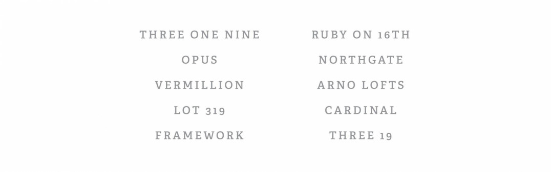
After narrowing down the pool of potential names, we landed on Three 19. Derived from the development’s street address, the name is fully grounded in the history and physical location of the place but incorporates a modern twist with the blended alpha-numerical structure and brevity. It is a name that is simple, direct, timeless and descriptive.

The qualities of the design direction we chose—drawn from the bold, economic lines of industrial fonts and textures—aligned with those used to guide the construction project: quality, design, detail. The final logo we presented was clean but not sterile, upscale yet functional. Overall, it is indicative of the quality of “affordable luxury” the development aims to offer its residents.
On its website, Three 19 boasts, “Modern living. Historical roots.” From its location to its architecture, and now with its name and brand, Three 19 blends these into an exciting new development for the city of Indianapolis.
